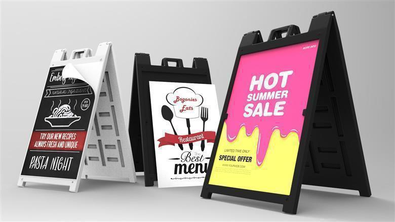
As you know, it depends on the content. But it should also be presented in such a way that it reaches the addressees in the desired way. We have summarized the most important points for you:
1. Clear, short and simple
“Do it smart and simple!” The sandwich boards Vancouver should show at a glance what it’s about. This can be done with a single image motif or with the help of the corresponding text, which ideally should not be longer than five words. If it is necessary to place information, for example, when announcing an event, the text should be divided into several groups, but not more than five.
2. Unity of image and text.
If the advertising message is accessible only through the interaction of the motive and words, the image and text should represent an optical unit. The inscription can be next to the image or inside it.
3. Readability
The inscription should be easy to read even at a distance. If you have to rack your brains for too long, you will stop being too receptive to the advertising message. Therefore, you should carefully choose the font and font size.
4. Matching design
Both the font, the image, and the color scheme should correspond to the advertising message, and ideally to the company. For example, an attractive woman in an evening dress looks out of place in an advertisement for agricultural machinery and in this case will bring a complaint about sexism, not new orders. Since an unusual design can attract attention, you should weigh in advance how far the agency or your graphic designer can go.
5. Recognizable sender
It is useless if the whole city is eagerly waiting for your offer and does not know where to get it. It sounds corny, but they forget about it more often than you think. Anyone who is interested in the advertised product should be able to easily identify which company it is and where it can be bought. If it’s an event or a time-limited offer, the date should also be visible.
6. Safe statements
Ambiguous advertising messages can ridicule not only passers-by but also competitors. Just in case, read the law on unfair competition.
Beware of missteps!
Provocation is a sure way to attract attention. However, in some cases, this may not turn out the way we would like – with negative consequences. Since it is very difficult to avoid advertising in public places, advertisers should pay attention to a number of things that can be summarized under two headings: threat and discrimination.
Weighing boundaries and non-discrimination
The topic of discrimination is even more complicated. What is humiliating and what is not, is not always easy to judge. This full-scale “fat bowl” can be avoided if no minorities, migrants, regions, or religious groups are targeted. When the line of sexism intersects, men are often perplexed. You can imagine a planned advertisement with a man instead of a woman. If it hurts your own ego, you can assume that the limit has been exceeded. However, it is safer to consult with several women before printing.
In what places can sandwich boards be placed?
In general, without permission, you can not place sandwich boards Coquitlam in any places where you want. Explicit advertising space must be ordered from the operator; permission is required for all public spaces. Regulation is a matter for each country and is implemented differently in individual municipalities. It is forbidden to advertise even on private territories and near private enterprises without special permission. The contact person is usually the building or public order service of the respective city or the responsible municipal administration.


