


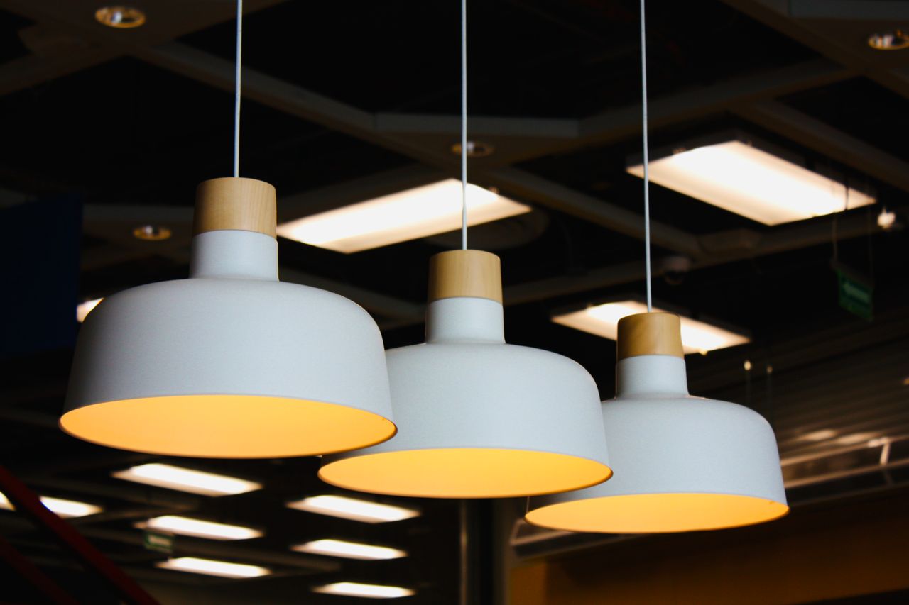
When a room feels unfinished, many homeowners immediately think about repainting the walls or replacing the furniture. However, one carefully chosen lighting fixture can often create a similar visual impact with much less disruption. Pendant lights are particularly effective because they provide useful illumination while introducing colour, shape, and personality at eye level.
Instead of treating lighting as a basic finishing detail, homeowners can use it as a focal point. Blue pendants can bring calm colour into a neutral room, while black and gold fixtures offer a combination of dramatic contrast and warm metallic detail.
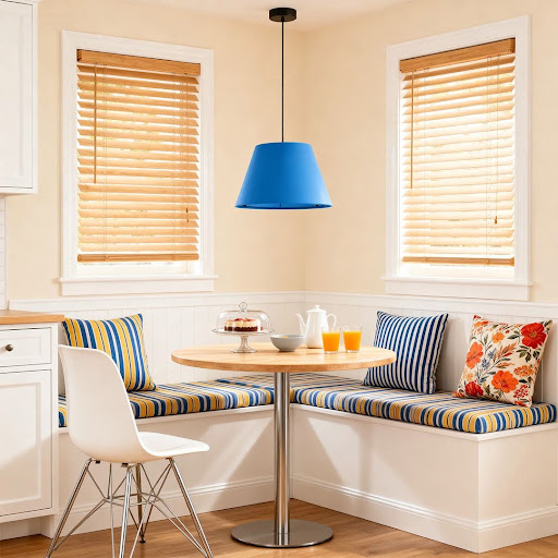
Blue pendant lighting can introduce colour without overwhelming a neutral kitchen or dining space.
Why Blue Lighting Works in Neutral Interiors
White, beige, grey, and natural wood interiors are easy to live with, but they can sometimes feel visually flat. A blue lighting fixture introduces colour without requiring a permanent change to the walls, flooring, or cabinetry.
A Blue Pendant Light can work particularly well above a kitchen island, dining table, breakfast nook, or reading corner. Pale blue creates a relaxed coastal feeling, while darker navy tones provide stronger contrast and a more sophisticated appearance.
The surrounding materials also affect the result. Blue pairs naturally with light timber, white marble, brushed metal, and warm neutral fabrics. Repeating the colour through cushions, artwork, ceramics, or tableware can help the fixture feel connected to the rest of the room.
Add Warm Contrast With Black and Gold
Black and gold lighting offers a different type of statement. Black creates structure and gives the fixture a clear architectural outline, while gold adds warmth and prevents the design from feeling too severe.
A Black and Gold Pendant Light can suit modern kitchens, dining rooms, home bars, entryways, and living spaces. It works especially well in rooms that already include black cabinet handles, dark window frames, brass details, or warm-toned furniture.
The finish does not need to match every metal in the room exactly. A small amount of repetition is usually enough. Black chair legs or gold-toned hardware can make the pendant feel intentional rather than separate from the overall design.
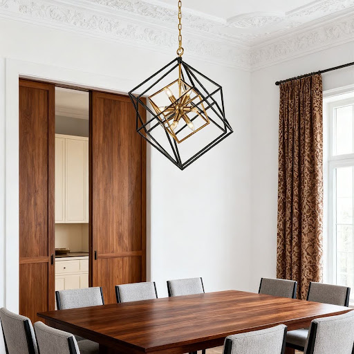
Black and gold fixtures combine modern contrast with a warmer decorative finish.
Choose the Right Size and Position
Colour catches the eye, so the importance of proportion is accentuated. A small fixture may look wimpy, and a large pendant can overpower a small room. Over a kitchen island, two or three small pendants often create a better sense of balance than one large fixture. A single statement piece can provide a definitive anchor point above a dining table.
Light should be hung low enough to be felt tethered to the furniture beneath (but not so low that it obscures lines of sight or interferes with traffic patterns). The fixture’s shape, brightness and shade material should be compatible with room use.
Finding a Style That Fits the Home
Homeowners exploring pendant colours, materials, shapes, and coordinated indoor lighting can browse Dazuma for options ranging from understated glass fixtures to colourful and decorative statement designs.
The right pendant light does more than brighten a room. It can add colour where the interior feels plain, create contrast where the design lacks structure, and make an everyday area feel more personal. Whether the choice is calming blue or dramatic black and gold, a thoughtful lighting update can transform the room without requiring a complete renovation.